
HouseKey
Design an app that enables users to find information about who represents them in both state and federal government.
Despite being in the most connected era in history, the gap between United States citizens and their government representatives seems to be widening. Between AI-generated fake news and biased news media, even the most engaged citizen may have trouble following the activity in their government today.
HouseKey is a way to connect the people to their government representatives without the middleman of traditional or social media or the dense, inaccessible language many primary sources use in politics today.

-
Date
JULY - OCTOBER 2024
-
Roles
UX RESEARCHER
UX DESIGNER
VISUAL DESIGNER -
Responsibilities
USER RESEARCH
WIREFRAMING
PROTOTYPING


User Research
I used a combination of primary and secondary research to collect qualitative and quantitative information about my potential user. While many Americans are aware that they are represented in their government by elected officials, not everyone is interested in engaging with their representatives on an ongoing basis. My goal in user research was to discover more details about who my user is, why they are motivated to engage with the political system as a citizen, and what their pain points might be with the tools currently available for engaging with their elected representatives.
Key Findings
Information about users’ respresentativs is…
-
Information about federal, state and local representatives is spread out across many products.
-
Representative activity while in office is difficult to find and understand. It is often filtered through biased news outlets and social media.
-
It is difficult to share information about how citizens can interact with the federal, state and local representatives.
-
Information about representatives and the ability to contact representatives is often inaccessible to non-English speakers or anyone unfamiliar with political jargon.
User Personas
-
George
THE INFORMATION SEEKER
George is an engaged citizen and leader in his Spanish-speaking community who needs information about his representatives’ activity all in one place in both English and Spanish because he needs to stay informed on issues that impact his community.

-
Emily
THE ADVOCATE
Emily is a student environmental advocacy leader who needs an easier way to share representative contact and advocacy information because she needs to be able to educate her friends and peers between classes.

Wireframes & Lo-fidelity Prototype
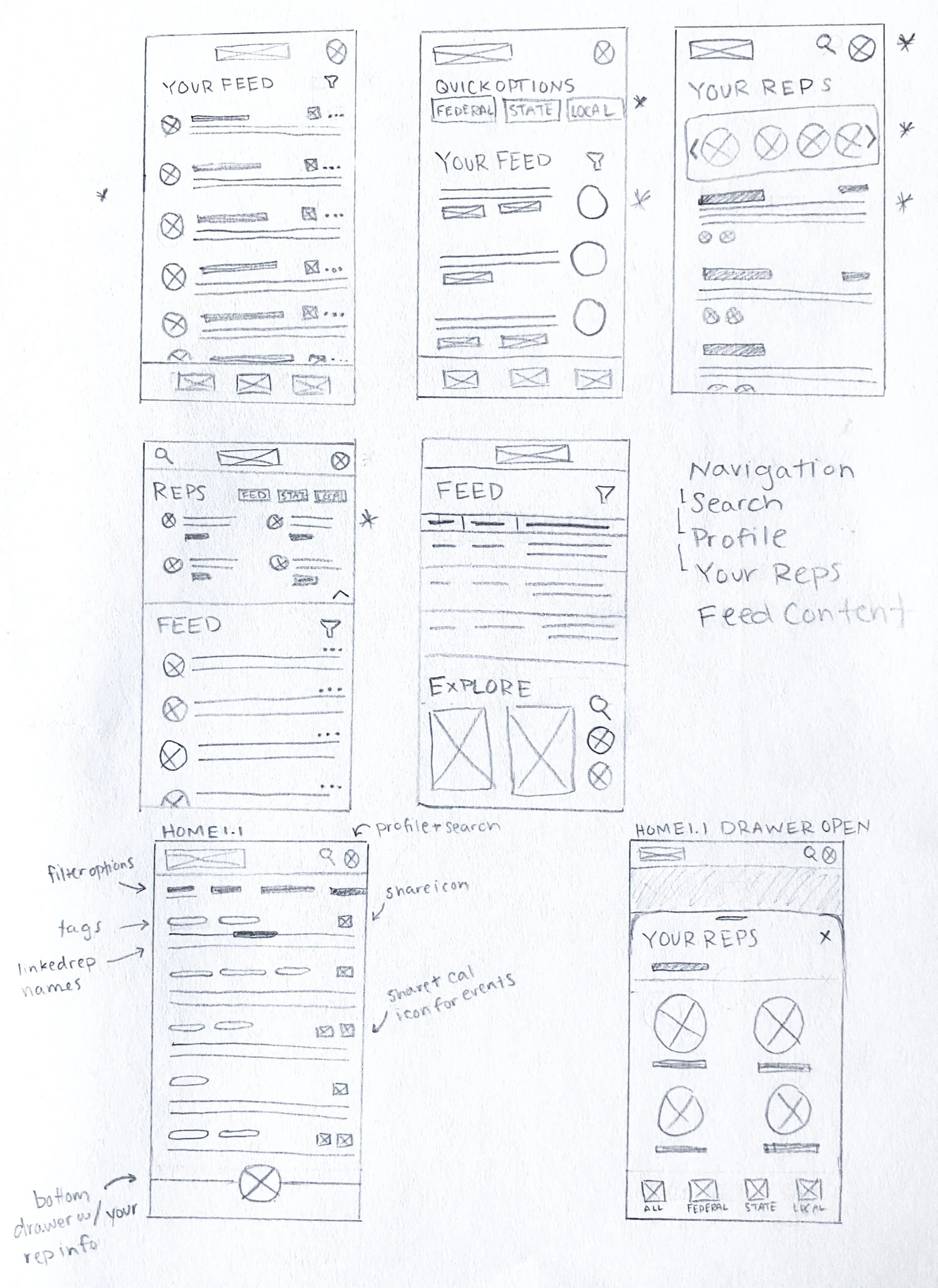
Hand-drawn wireframes of the app's homepage. I drew initial inspiration from social feeds like Twitter and Reddit. The main navigation included the home page, a profile page and search page. The paper prototype included a drawer that housed the user's representative information at a glance.
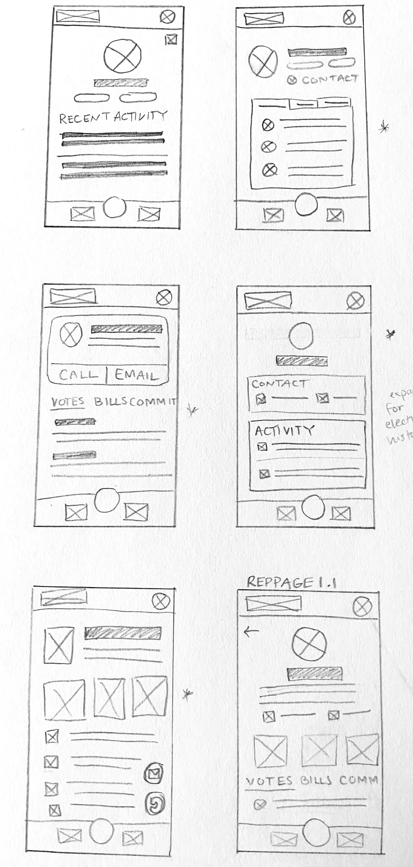
Hand-drawn wireframes of a sample representative profile. Features include buttons to immediately call or email the representative and an activity feed of their recent votes, committees and other actions in Congress.
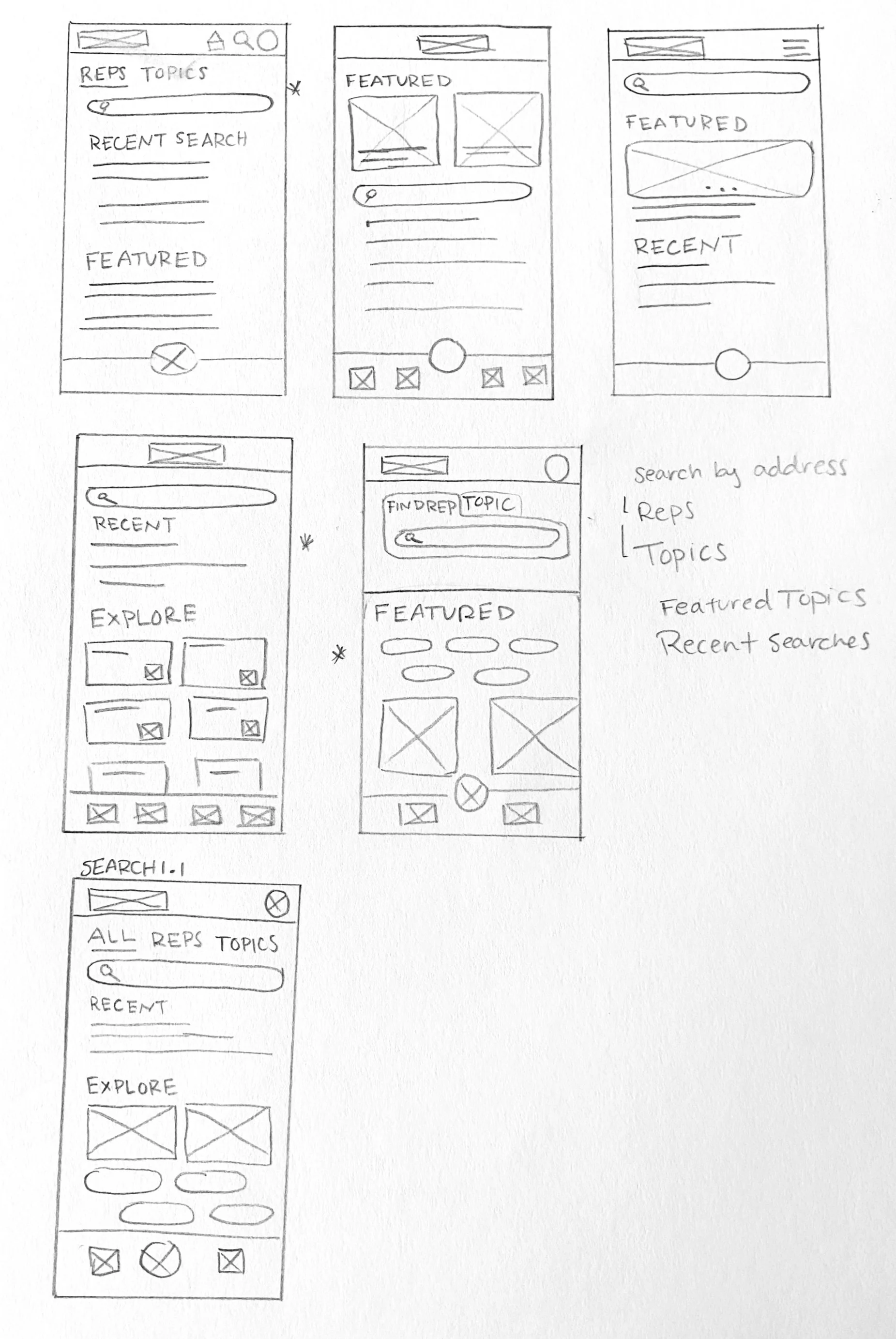
Hand-drawn wireframes of the app's search functionality. I brainstormed ways to make the search page also function like a "explore" page where users could tap through different issues they're interested like education or foreign policies.

Digital wireframe of the homepage. Key features include global navigation at the bottom of the screen, a scrolling secondary navigation at the top, tags for users to scan for topics they're interested in and a share button.

Digital wireframe of the home page drawer. Users can tap through the secondary navigation at the bottom of the drawer to filter by level of government. Users can tap a representative to navigate to their profile page.
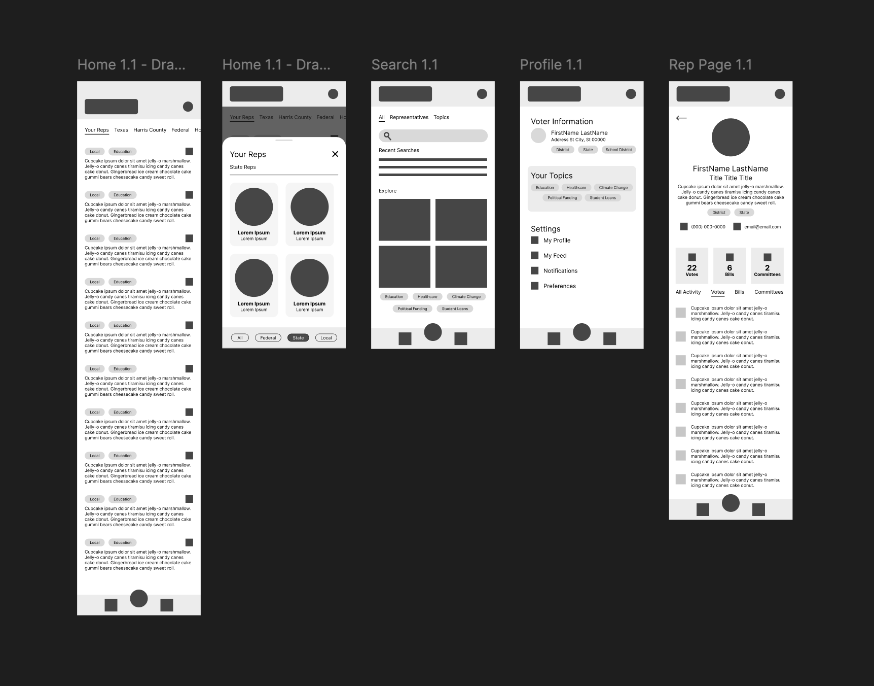
Digital wireframes for all pages in the initial design.
Usability Study Findings
-
01
Lack of visual hierarchy makes the feed information feel overwhelming
-
02
Rep details require too many taps, burying one of the primary functions of the app
-
03
Users like the ability to view political updates on topics, but they’re difficult to navigate when mixed into the feed.

Homepage Adjustments
After user testing, I reworked the homepage to incorporate more visual appeal and hierarchy. I also incorporated the content of the rep drawer into the top of the homepage.

Issues Page Added
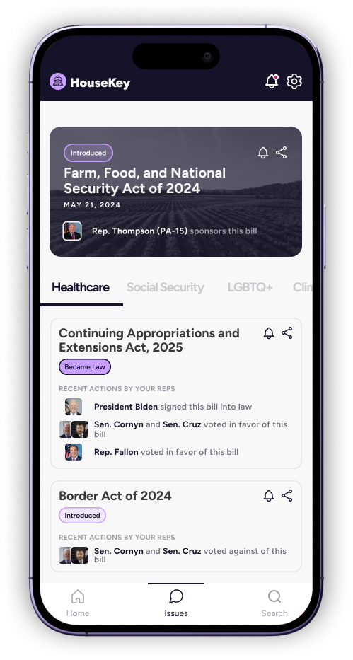
After the usability study, I added a separate Issues page to house updates related to certain topics like Healthcare, LBGTQ+ Rights, and more.
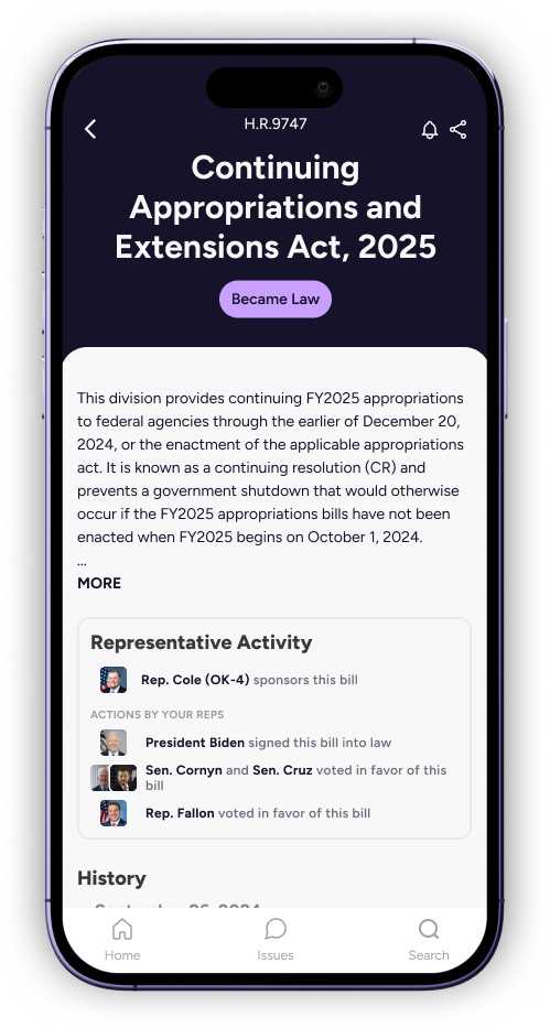
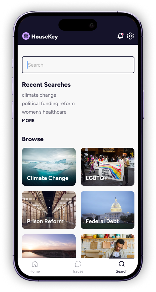
Hi-fidelity Prototype
The final protoype takes the user through the home page, the rep details page, bill details page, the issues page, search and settings.
Reflections
In a product intended to disseminate information, it’s important to have a strong sense of hierarchy and visual communication. Users are used to scanning information-based apps. As the UX designer, I learned a lot from taking on the challenge of communicating complex information in a way that looks and feels simple.