Rural King Careers
Redesign a landing page for users looking for more information about Rural King's career opportunities.
Rural King is a general store based in Mattoon, IL with retail locations scattered across the midwest and Florida. Their HR and marketing teams needed to improve the careers landing page in their website, so prospective applicants could easily find information about Rural King's job opportunities.
-
Date
JANUARY - MARCH 2024
-
Roles
UX DESIGNER
VISUAL DESIGNER -
Agency
User Research
Rural King's previous careers landing page was a functional gateway to find all job openings, but didn't tell prospects much about Rural King or what they stand for. In addition to improving how users navigate to relevant job openings, Rural King needed to incorporate content into their landing page that communicated their brand and company culture to potential applicants.
Key Findings
Users need to…
-
Users preferred a landing page where applicants from multiple career fields can easily find job openings.
-
Users want to know how a company supports employees in building long-term careers. We want to show that Rural King is supportive atmosphere for all employees.
-
Users looking for a job want to know the company aligns with things that are important to them. Communicate Rural King's values and history to prospective applicants in an easily digestible way.
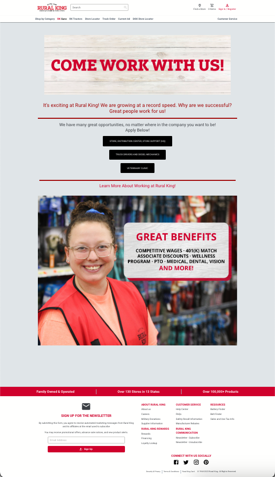
Previous Landing Page Design
The previous landing page design was functional, but with lots of room to grow. While the page did link to some specific job functions and communicated attractive benefits for employees, there was opportunity to add content and functionality to this page.
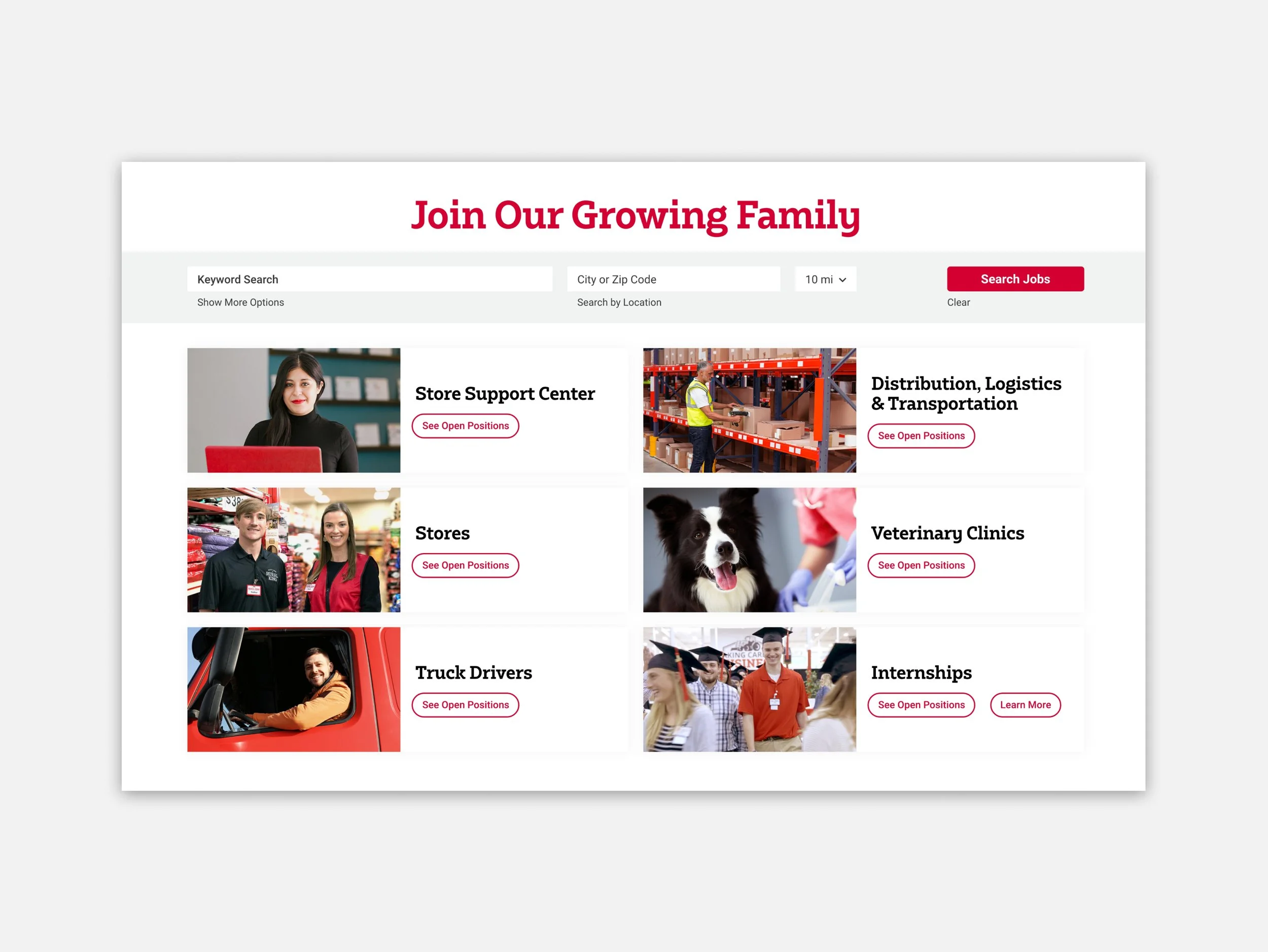
Job Openings
The top of the page features an updated section for job openings. There is a prominent search bar above several cards representing core job categories for Rural King applicants. Photography, headers and clear buttons tell the user what kinds of job openings they can expect to see when they click "See Open Positions".
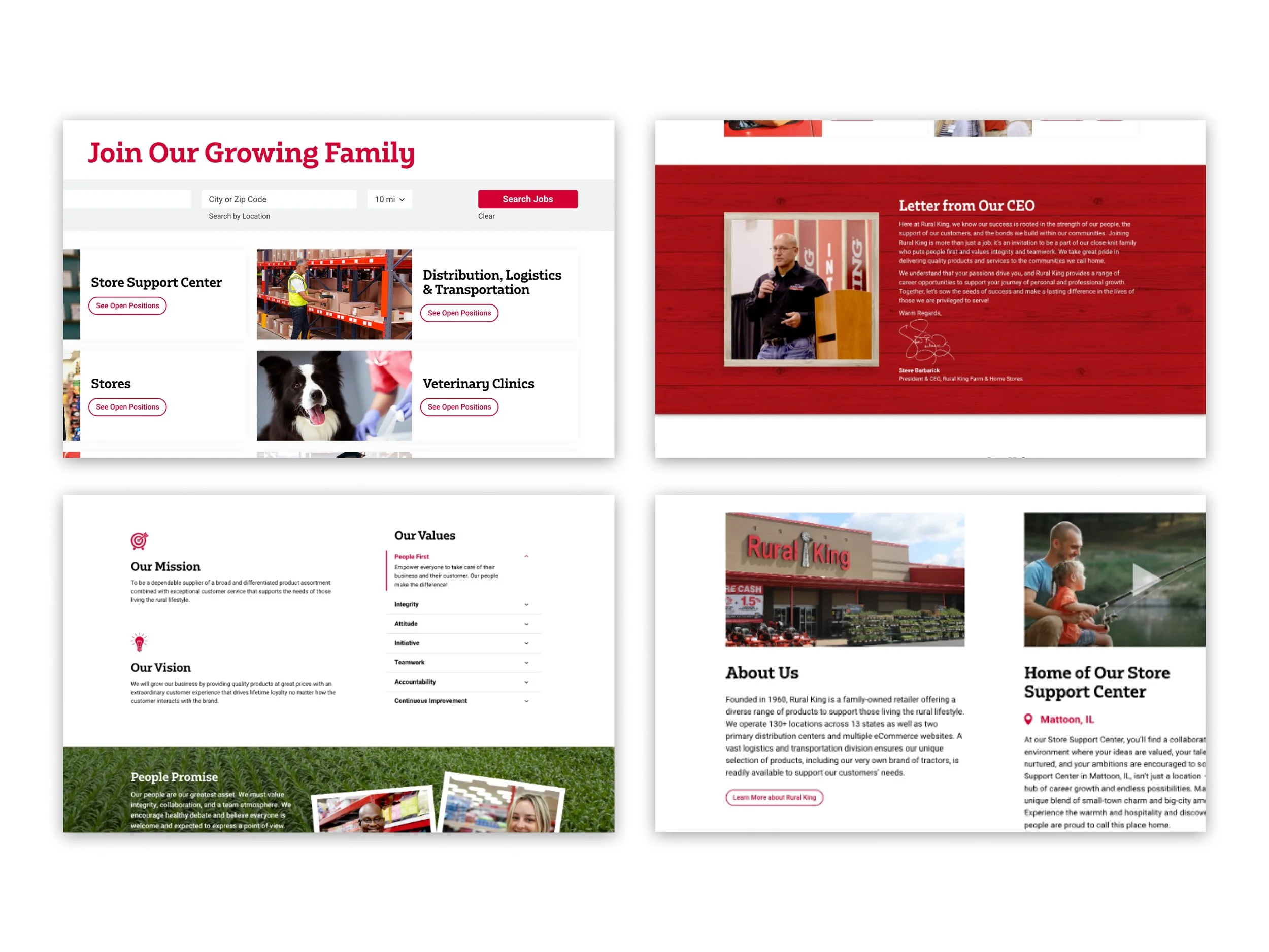
Pops of Red
The page feels visually cohesive with pops of Rural King red serving as a visual thread in various UI elements. Headers, buttons, icons and imagery all feature Rural King red to communicate a strong visual brand and a feeling of unity.
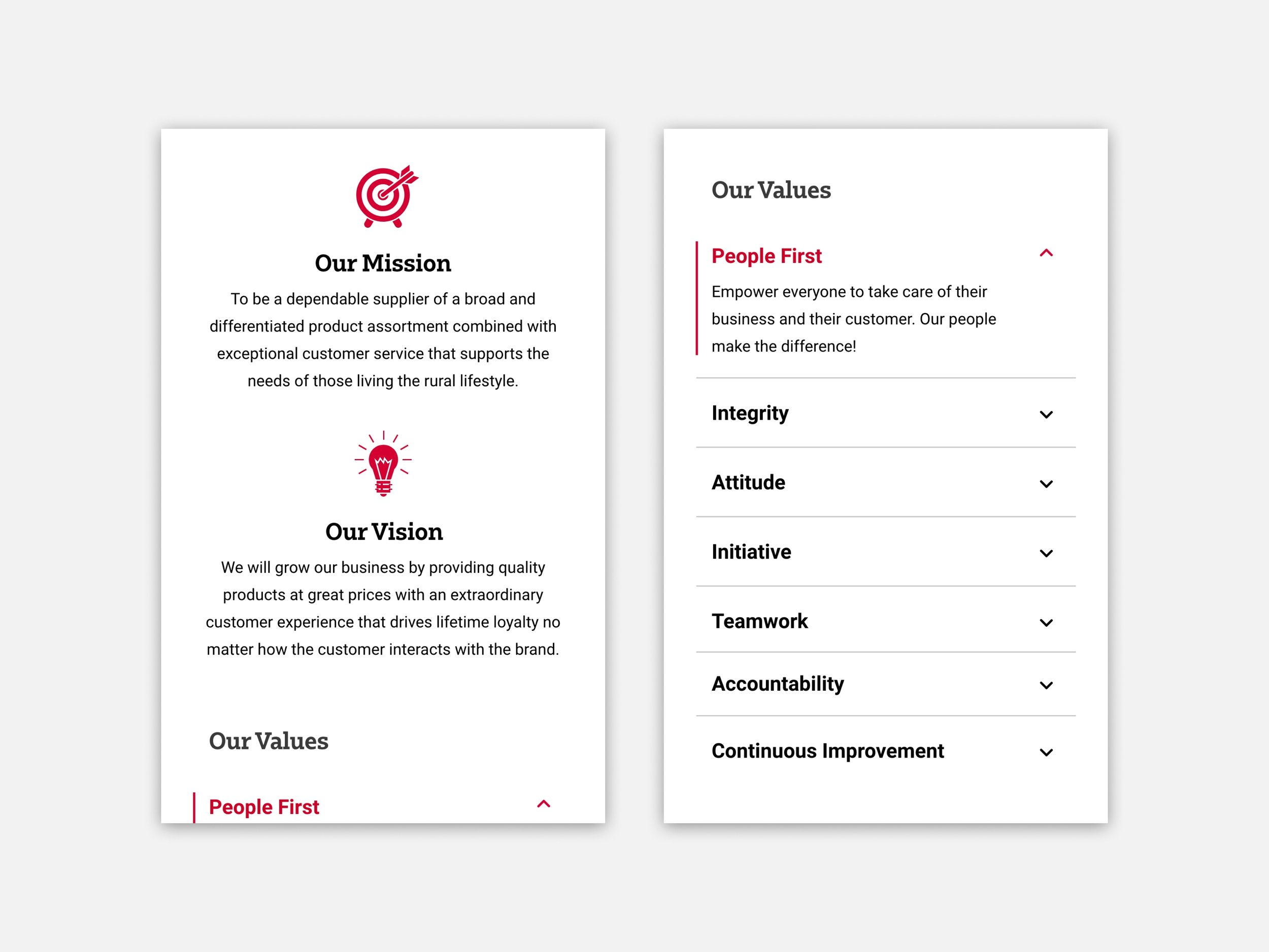
Mission, Vision and Values
Rural King wanted to communicate their company mission, vision and values in a visually digestible way. The use of iconography helps the user visually scan the page and understand the content they are about to read. The accordion table compacts longer information so the user can easily peruse the values at a high level. If one value piques their interest, the user can click or tap to expand the value and read more.
Employee Benefits
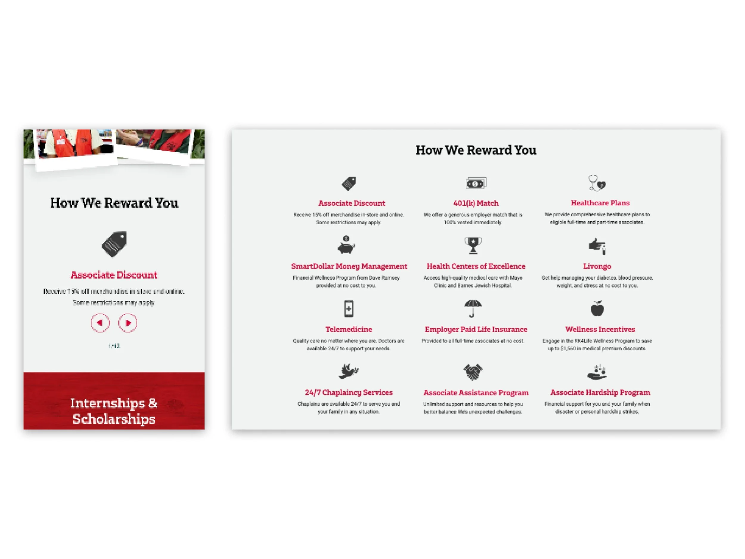
Rural King offers a wide range of benefits they needed to highlight on this landing page. On desktop, the grid of icons with short sections of text is easily scannable as users scroll by. For mobile, we incorporated a horizontally scrolling carousel to condense the benefits into a module that took up less vertical space on the page.
Reflections
While designing this landing page, I was able to explore how to play with branding to improve the effectiveness and functionality of a page. The HTML & CSS each played a pivotal role in providing hierarchy, unity and visual interest to this content. I paid special attention to photography selection and editing to create a cohesive feeling to the page.


