
Petsense
Design WYSIWYG-friendly email templates for Petsense's weekly newsletter.
Petsense is a regional pet retailer acquired by Tractor Supply in 2021. Their marketing team needed to evolve their email design for a better customer experience and improved internal workflow.
-
Date
SEPTEMBER 2022
-
Roles
UX DESIGNER
VISUAL DESIGNER -
Agency
User Research
The previous Petsense newsletter utilized a common but outdated technique of designing separate JPGs stacked in a single column to achieve the appearance of a coded email. However, the client and their customers were struggling with usability because the emails were time-consuming to build, not mobile responsive, and inaccessible for many users.
Key Findings
The new templates needed to be…
-
The main user, the client, needs a WYSIWIG-friendly email template that can be reproduced in Klaviyo by a marketing manager.
-
Both the clients and end users would benefit from emails built with responsive and accessible design practices. This includes mobile-first design, eReader-friendly HTML and other accessibility considerations.
-
Users’ experience of the email is improved with a positive brand impression. Petsense's playful brand personality front and center for newsletter subscribers.
-
The Petsense team wanted to continue to iterate on the email design by collecting user feedback via metrics. They oIncrease open rates and click-thru rates while decreasing unsubscribe rates.
Previous Landing Page Design
While the former email technique allowed for nearly unlimited design configurations, it sacrificed accessibility which resulted in low click-thru rates and high unsubscribe rates.
Wireframes
-
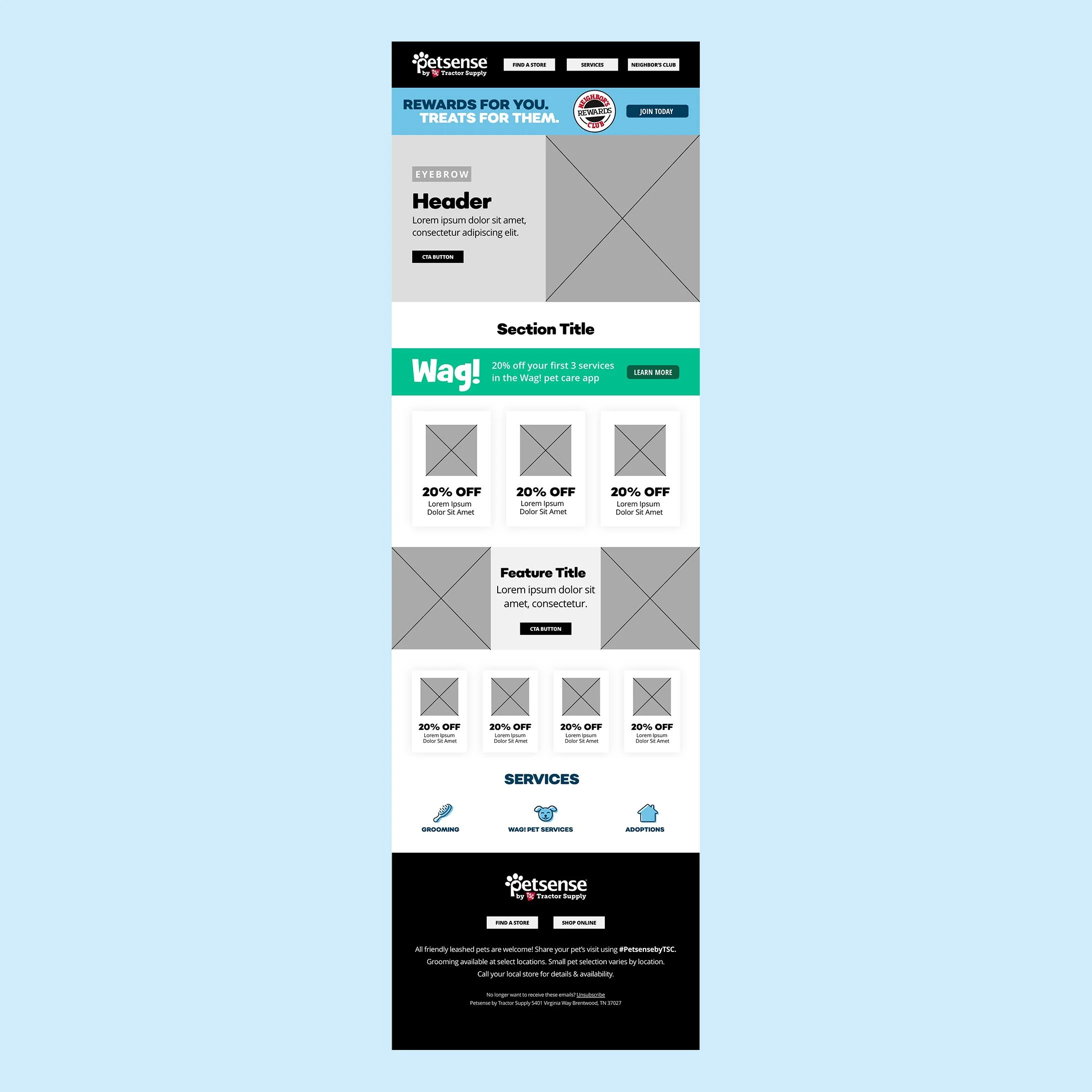
Compact
The first wireframe featured compact modules with lots of places to grab attention and get the click-thru in a shorter scroll length. Images are smaller and more abundant (good for featuring product images.) 1-, 2-, 3- and 4- column configurations interplay in the same email giving the feeling of abundant choices and variety while still allowing for mobile responsiveness.
-
Editorial
The second wireframe features very tall modules with large imagery for focused, editorial feel. Images are larger but less abundant (good for a cohesive visual story using lifestyle imagery.) Copy is used for style, impact and storytelling over purely conveying an offer. Offers can be present, but less of a focus.
-

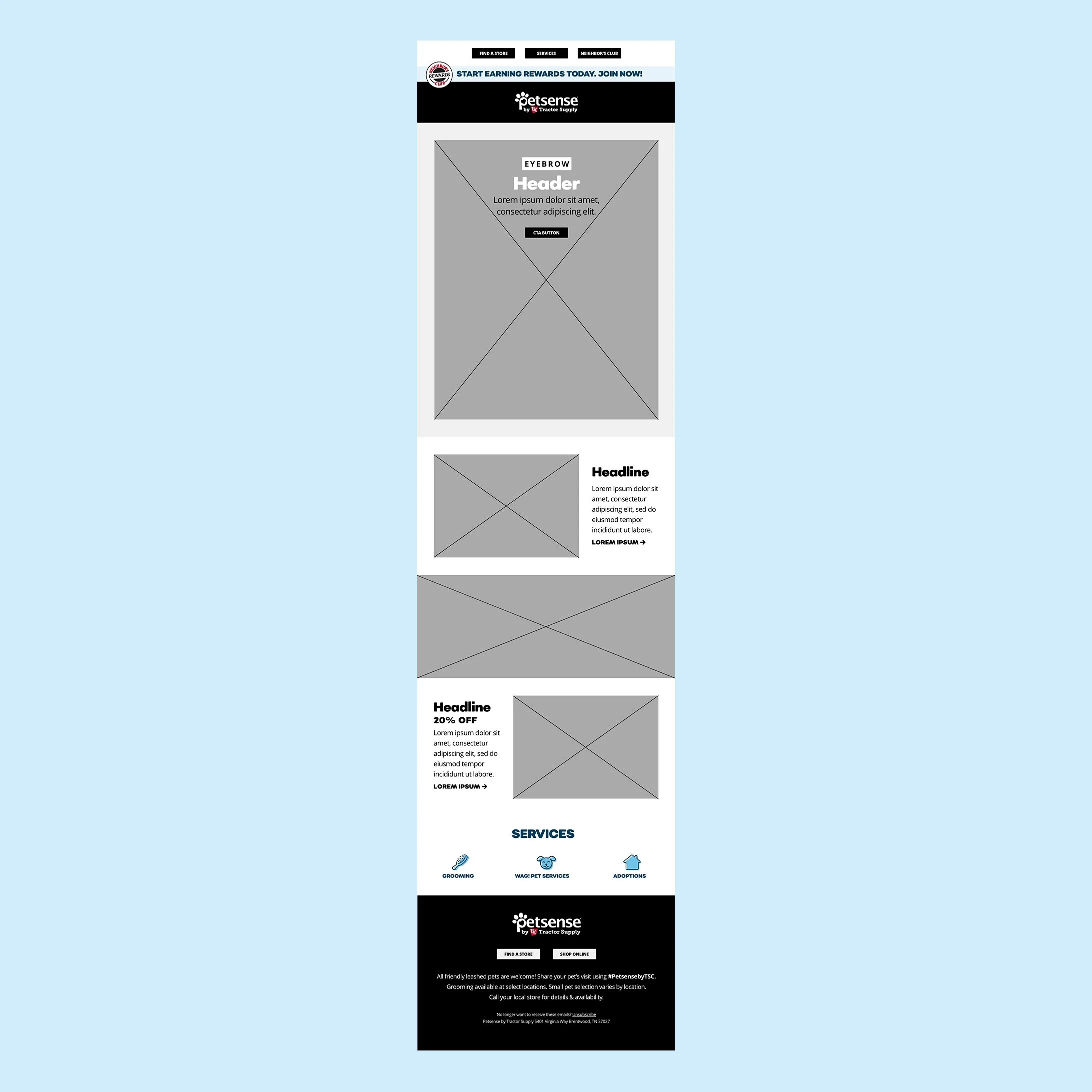
Mixed
The third wireframe features images in a variety of sizes to be utilized depending on purpose. 1-, and 2-column layout allows for flexibility, adding more detail as you scroll down the page for highly engaged users. Medium height modules give flexibility of content like a newsletter. Product promotion and editorial content each have their places, but don’t really mix.

Versatile and Functional
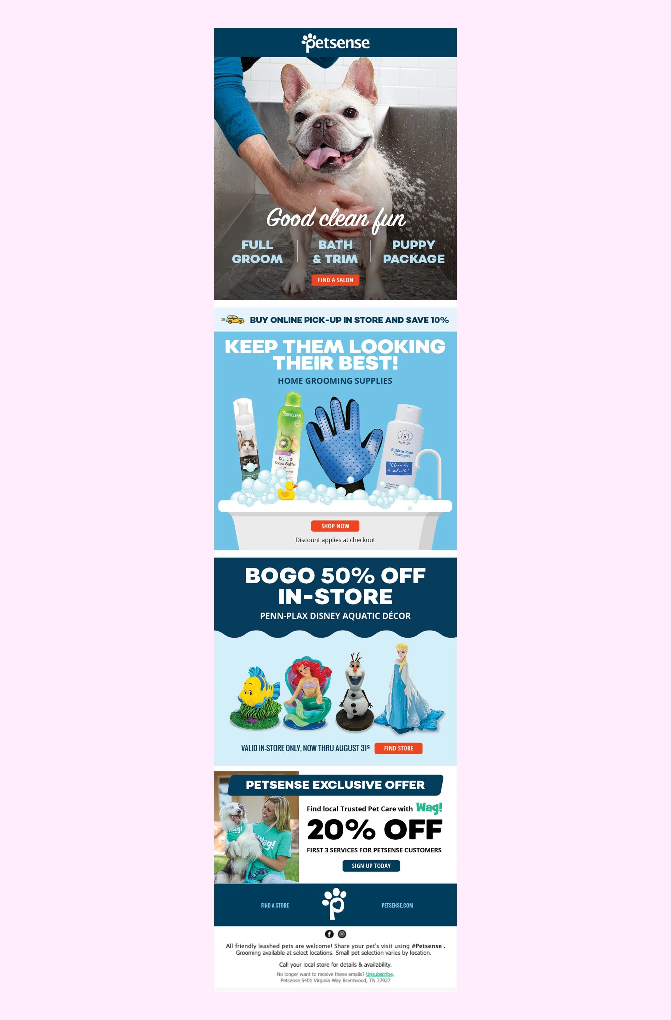
The final template design features large playful images for immediate brand impact. A combination of 1- and 2- column modules allow for content versatility in the newsletter from week to week.
Evergreen Iconography
As the design process progressed, it was clear that there was a need to link to Petsense's various services in every email. I developed a series of icons for these services to match Petsense's existing icon style used on their website.
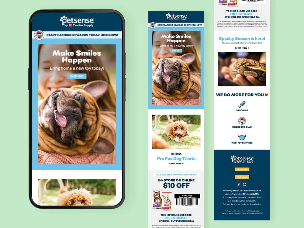
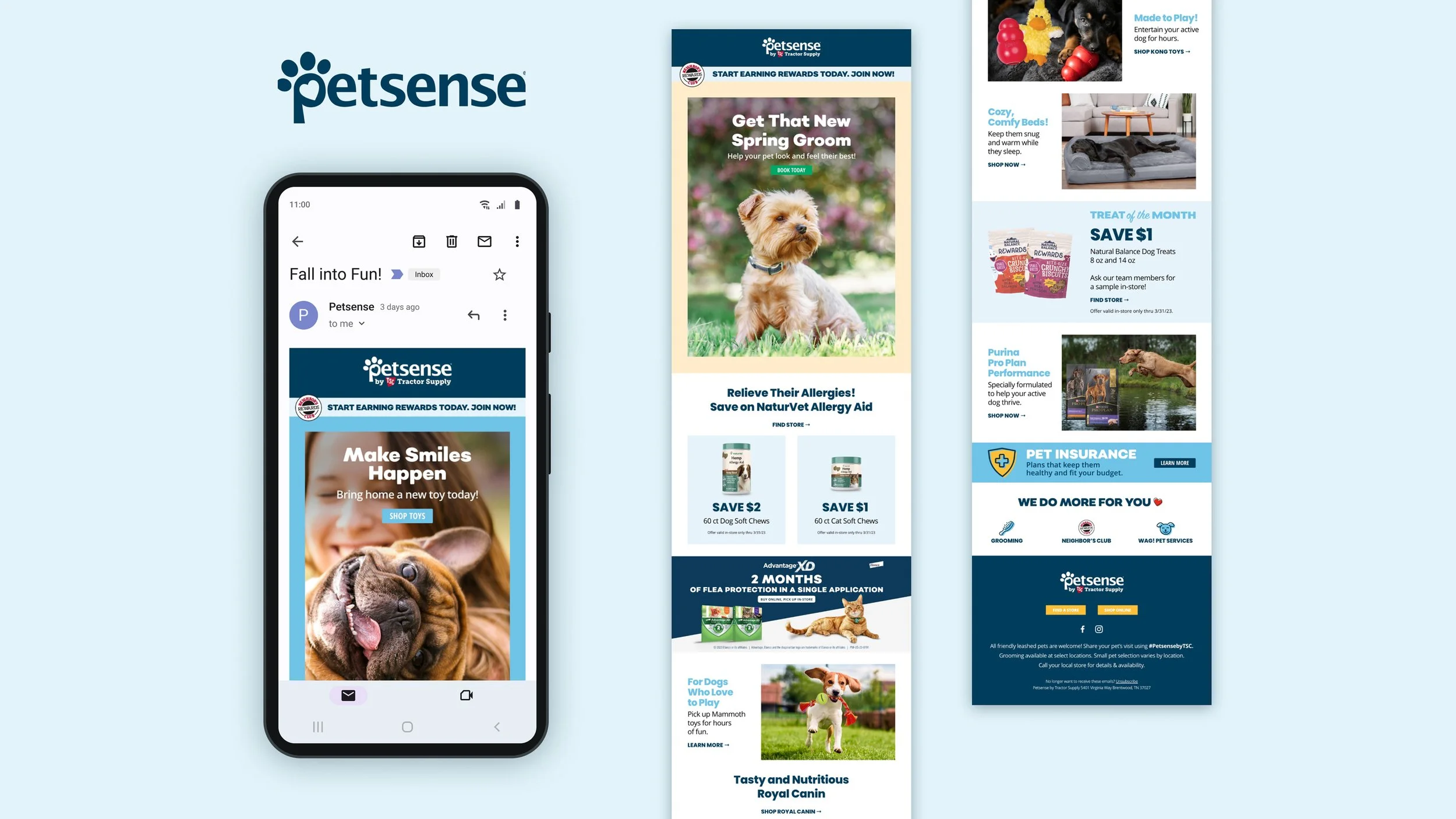
Mobile Responsive
The final template is both mobile responsive and & accessible. The incorporation of live-text allows users to utilize tools like dark mode, screen readers and switch devices.
Reflections
In developing email templates for continued use in a WYSIWYG platform, I learned about the importance of designing modules for a variety of uses. It was important to have enough uniformity for the emails to look and feel consistent, but enough modular variety for the emails not to feel stale.
I also learned about the capabilities of Klaviyo, which was the particular WYSIWYG the client was using. While it can't do everything, Klaviyo has extensive capabilities that enable anyone to build bulletproof emails efficiently.